I wanted to start with a bit of disclaimer on this article. There was no scientific, stats-based analysis that went into the following selections. They are just kits that I remembered as being particularly rotten. There is no doubt that I will have overlooked many others and the selection of this infamous five is in no way an endorsement for any other shirt. That said, I stand by my choices as they are undoubted stinkers. So much so that I couldn’t bring myself, or be bothered, to order them so feel free to decide in which order they should fall. I look forward to hearing why everyone believes I am wrong – you can tell me on Twitter.
Genoa 3rd kit 1994-95
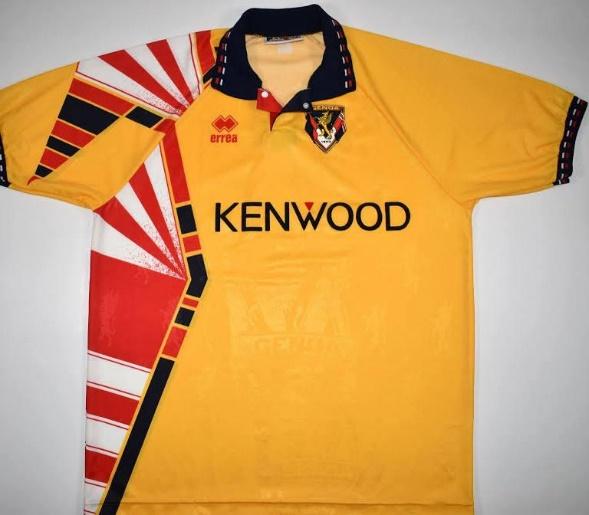
I’ll admit to a bit of personal bias when it comes to Genoa’s 1994-95 third kit. I don’t like yellow kits. I’ve nothing against teams that have it as their traditional colours, I just don’t like yellow. What cements this Erra designed kit in my worst five is the fact that it’s mustard colouring actually isn’t the worst thing about it.
You know when you’re wrapping your Christmas presents and you run out of paper half way through covering a gift, so you use a differently patterned paper to cover the remaining part of the present? I can only assume that was what happened when this shirt was first put together. When the Erra shirt making team were putting together the prototype for this and the two-week-old-banana coloured material ran out, they naturally reached for red and white to fill the gap. The result is a horrendous colour clash and a kit that looks like two completely different shirts have been stitched together. It also has a distinct air of Ronald McDonald about it.
Another issue I have with this shirt is the sponsor placement. You didn’t notice that did you? It’s slightly off centre, which leads one to wonder if the sponsor has been moved to avoid the pattern or if the pattern has been added to distract from poorly placed Kenwood logo. Either way the result is a shambles of a design which was aptly worn by a Genoa side which was relegated that season.
Foggia 3rd kit 1991-92

In a strange sort of way this Foggia shirt can be seen as ‘before its time’. It’s common these days for club shops around Europe to sell a club-themed Christmas jumper every festive season. The novelty knitwear bandwagon has been firmly leaped upon in recent years but back at the start of the 90s, Foggia appear to have requested a third kit which could also be worn on December 25th.
It’s unclear if the pattern has any kind of relevance but irrespective, it’s an overly busy shirt. If they had settled for the red and black it wouldn’t have been so bad. The white pattern resembles some kind of strange crop circles that look like they have been added accidentally.
As well as looking like a particularly ugly Christmas jumper, it also looks like it was originally supposed to be a plain red shirt. Instead, it looks as though that perfectly normal red kit has been left lying in the road and has been run over by a truck with white paint on its wheels. The 90s was known for it brightly coloured kits with crazy designs. It’s part of the charm of many classic shirts of the era but this design is more suited to a shirt worn by a darts player than Beppe Signori, who was in the Foggia squad that season.
Padova away kit 1995-96

I’m not sure where to start with Padova’s away shirt from the mid-90s. Only joking, the horse. I’m starting with the horse. Palazzo della Ragione is a large palatial building in the city of Padova. Housed within one of its large medieval halls is a gigantic wooden horse, built in 1466. The horse is often mistakenly credited to Renaissance sculptor Donatello but is in fact based on his Equestrian Statue of Gattamelatta which is situated elsewhere in the city.
The horse clearly has cultural significance to the area which makes the representation of this historic statue on the Padova shirt understandable. What is hard to fathom is that they appear to have tasked a primary school child to draw the horse for the front of the kit. The more you stare at the head and neck of the horse, the less it looks like the equine statue which it is supposed to represent. It actually looks more like a profile view of Beaker from the Muppets. ‘Vera’ is perhaps the name of the child which drew the horse rather than a corporate shirt sponsor. It’s notable too that there isn’t a club crest on the shirt which was maybe an attempt by Padova to distance themselves from its deformed horse/statue/Muppet.
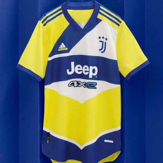
Juventus third kit 2021-22

This is the most recent of my selection but the decision to include this one has been heavily influenced by a kit from the 1990s. Juve’s iconic away shirt in which they won the Champions League in 1996 was a thing of beauty. The royal blue shirt was adorned on either shoulder by two yellow stars, representing the more than twenty Scudetti that the Turin club had won until that season. One can only assume that the designers at Adidas used that kit as reference when choosing the colour palate for this shirt. Unfortunately, that’s where the similarity ends.
It’s hard to know if the pattern on the shirt is supposed to signify anything which probably indicates that it isn’t. The design is overcomplicated and there could be a decent shirt there with a little bit of tweaking. If you take out the large white sections and the diagonal blue shape containing the Adidas logo then then you would have a much cleaner design and one which wouldn’t have made the list.
The manufacturers have also tampered with the classic Bianconeri home shirt design which in itself is a crime worthy of a place on the list. Instead, I opted for this yellow and blue monstrosity which looks like a combination of shapes borrowed from various road markings. The secondary sponsor beneath the main Jeep logo looks like it has been added well after the rest of the design had been finished. All in all, this design might’ve made a half-decent kit for an English Rugby League side but it’s an affront to its 1996 inspiration.
Venezia home kit 1998-99

Before their designer fashion inspired kits became the envy of fans all over the world, Venezia were embarrassing themselves by taking to the field in this atrocity. The club owner at the time was the late Maurizio Zamparini who owned a chain of department stores named Emmezeta. The store name featured as the sponsor on the shirt and I’m willing to bet that you would’ve have been hard pushed to find a more horrible garment on sale in any of his stores. The shirt itself is a pretty standard late-90s number with baggy sleeves and a collar. It’s the features that make this a bad kit rather than the style.
Let’s start with the club crest. The design of the crest, which features a winged lion, isn’t too bad but the thick white background makes it look like someone has bought a patch at a market stall and had their mum sow it onto the shirt for them. Kronos, the shirt manufacturers name, is more prominent and bigger than the crest and it’s surprising that they would be so keen to claim responsibility for this design. Then we have the colourful lion which adorns the right side of the shirt’s chest and shoulder. A winged lion is a pretty bad-ass thing to have on a club crest but the interpretation of the shirt designer is anything but. It looks like a mixture of a bunch of flowers and a Cockatiel with the face of a Labrador. The fact that Alvaro Recoba was in the team that wore this kit is the only positive thing I can find about it.
Ugliness, like beauty is in the eye of the beholder and whilst I agree with your first four choices I won’t hear a word said against the Venezia shirt.
imho genoa 1994/1995 Is One of the best looking jersey.